As you’ve probably noticed, we’re currently running a survey. That’s because we have a new intern starting who is training in retail marketing, and talking to her made me realise we hadn’t actually checked out any of our assumptions about our fans in oh, about 4 years!
Plus I do love a good graph. Mmmmm... tasty tasty data. And I’d been wondering where on earth all the people that google for Kiss Me Deadly hear of us in the first place, since you know, we like spreading the word.
Anyway, just under 300 people have taken part so far, albeit with advance notice of our bribe at the end, and I thought a few of you might be interested in some preliminary results, especially as Survey Monkey have made it ridiculously easy to do!
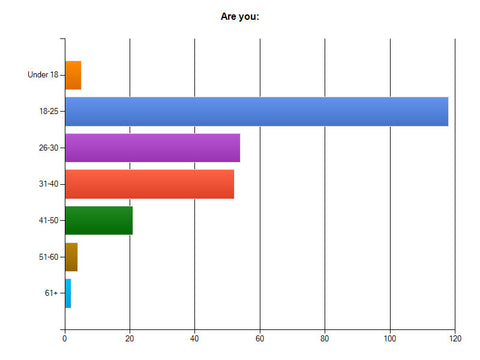
The chart of surprises

This one really threw me. Back in 2007, our fanbase was in its mid 30′s and 40′s. In 2010 it was mid 20′s to 30′s. Now it’s 18-25 – though to be fair the 26-40 year olds as a whole offer some competition.
Why is that important? Well, lifestyle, income and bodies change a good deal over time and especially from 20-30. 18-25 years olds tend not to have much disposable income, so I’m even more grateful to everyone who buys KMD as I suspect it’s probably even more of a push than we suspected for a considerable percentage of you. It also means we need to tailor things a bit to younger bodies rather than my 30-something impulses all the time!
Obviously, the fact that we said there was a discount for completion could have skewed the figures towards younger people who are more likely to want it more, but we’ve done this with our last survey too and yet the figures are very different, so I think it’s a genuine shift
The chart that totally shows I’m right, or so I’m going to claim

Remember ages ago I talked about how an average doesn’t mean that either a) your particular group of people are what the national average is or that b) the majority of people are that size?
This graph shows a population where the bulk of people are between a UK 8-12, with an average that doesn’t match up to the national average. Those of you following the age thing will know that younger people tend to be a smaller dress size – so that makes sense. But we could also have a chicken and egg situation, because we don’t do over about a UK 18-20, those people won’t have heard of us or bother filling out the survey.

And here’s the intractable bra problem. There are so many bra sizes that people are spread across a huge number of them, and no factory is going to let you produce less than 12 bras in a size. All other responses is on there because all the other sizes, from 28 A to 44K and “other” had so few responses that they can’t be shown on the graph properly. Welcome to why many brands give up and stick to core sizes that they know they can sell – because anything else is hugely risky and could mean you paying for lots of bras you then can’t sell.
My favourite chart!

Wheeeeeeeeeeeeeeeeee!
This is the chart of happiness, since generally you are happy. But, we did ask people to specify if anything especially terrible or great happened, so we’ll be going through and tackling things that went wrong and making sure we know what went well so we can be sure to keep doing it.
Well, thats my bank holiday weekend planned. It’s not like we were going to get any sunshine anyway!
If you haven’t filled out the survey, click here – and remember to use your discount code here before the 1st June 2013.