Last week a colleague was talking to me about "pale coloured retro basics" and it got me thinking about our retro classics. This range is all the things that sell regularly - which for us is a selection of suspenders, shapewear and the ever-comfortable doren bra.

For the last while I've done these in black Carvico Sumatra fabric (originally used for swim, dance or athletic wear - this lasts forever!) or ivory Boselli satin. Last year I decided to stop using Boselli simply because the factory were erratic about which panels they used it on which was driving me round the bend!
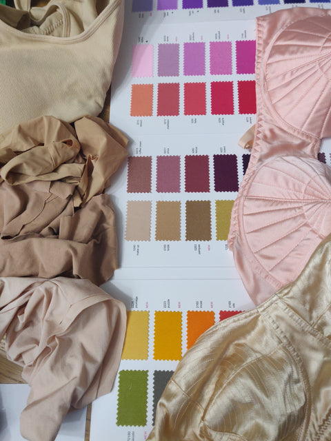
But my colleague got me thinking about if I should drop ivory altogether and go for some other pale colours. Except in practise, as a small brand making things in the 10's-100's, I have to use what's available, custom dye is not really an option at this size. There's so many elastics, trims, fortitube and so on used in these things and you have to get them all vaguely to match from what's available already.
So if I want a pale colour then it's basically full on white, ivory, or . . . various shades of beige. Everything comes in beige in lingerie land.
The swatch card from Carvico calls the easiest to match shade 'make-up" but let's be real, its light beige.
So I guess what I am saying is . . . . would light beige actually be better?! would it look alright with peach and champagne shades (look I think the latter is just a strange beige) from Bettie Page and/or all the billion custom beige shades the bigger brands use?
Or am I just having a reverse mid-life crisis?!


